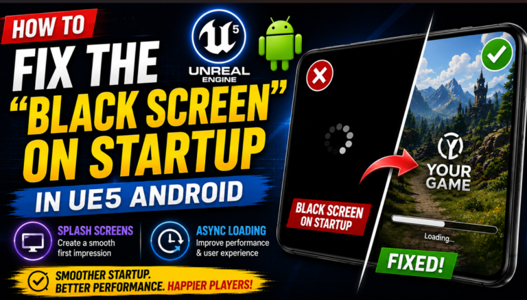
Fix UI Scaling & Camera Notch Cut-offs in UE5 For Android
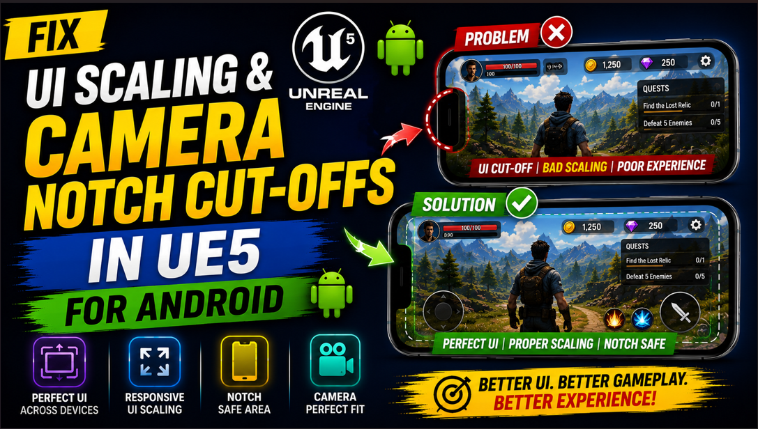
Building a game UI in UE5 feels great until you test it on your actual Android phone. Buttons are in the wrong place, text is too small to read and half your UI is hiding behind the camera notch. Everything that looked perfect in the editor looks completely broken on the device.
Very few tutorials actually explain why this happens or how to fix it properly. By the end of this article you will know exactly what is causing these problems and you will have a working solution for both UI scaling and notch cut-offs on any Android device.
Why UI Scaling Breaks on Android
The root cause of this problem is that Android devices come in hundreds of different screen sizes and resolutions. Your phone might have a 1080×2400 screen. Someone else’s phone might have a 720×1600 screen. Another player might be on a tablet with a 1600×2560 screen.
When you design your UI in the UE5 editor you are designing it at a specific resolution. If you do not set up proper scaling rules UE5 will either stretch your UI to fill the screen which distorts everything or it will keep your UI at a fixed pixel size which means it looks completely different on every device.
On top of that modern Android phones have features like camera notches, punch hole cameras and curved screen edges that physically block part of the display. If your UI does not account for these your buttons and text will be hidden behind hardware cutouts that your players cannot see past.
Part 1: Fixing UI Scaling
Step 1: Understanding DPI Scaling in UE5
UE5 uses a system called DPI Scaling to handle different screen resolutions. DPI stands for Dots Per Inch and it is a measure of how dense the pixels are on a screen. A phone with a very dense screen has a high DPI which means its physical size might be small but its resolution is very high.
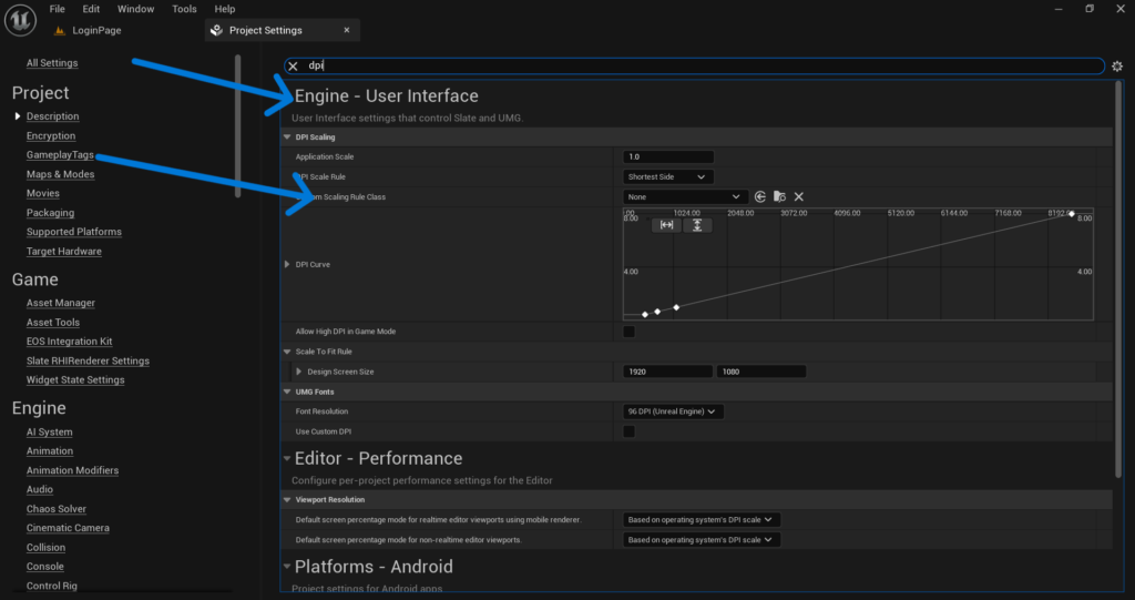
The DPI Scaling system in UE5 lets you define rules for how your UI should scale based on the screen resolution of the device it is running on. Without these rules your UI will look perfect on one device and completely wrong on every other device.
Go to Edit > Project Settings > Engine > User Interface and find the DPI Scaling section. This is where you control how UE5 scales your UI across different resolutions.
Step 2: Set Your Design Resolution
The first thing you need to decide is what resolution you are designing your UI for. This is called your Design Resolution and it is the reference point that UE5 uses to scale everything else.
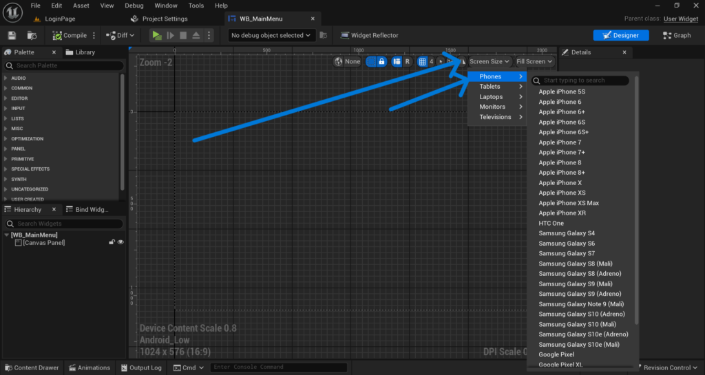
For a landscape Android game a good design resolution is 1920×1080. For a portrait game use 1080×1920. Pick one and stick to it. Every widget you create will be designed as if it is running at this exact resolution.
In UE5 the design resolution is not set in one central place. Instead you set it inside each Widget Blueprint. Open your main Widget Blueprint and click on the canvas. In the Details panel you will see a section called Design with fields for Width and Height. Set these to your chosen design resolution like 1920 for width and 1080 for height.
Do this for every Widget Blueprint in your project. Consistency is important here because if different widgets use different design resolutions they will scale differently and your UI will look inconsistent across screens.
Step 3: Configure the DPI Curve
Go back to Edit > Project Settings > Engine > User Interface > DPI Scaling. Here you will see a curve graph that maps screen resolution to a scale value.
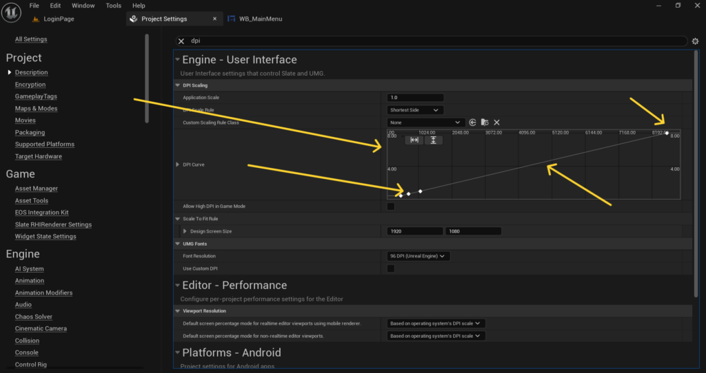
The X axis represents the screen’s short dimension in pixels. The Y axis represents the scale multiplier that UE5 applies to your UI at that resolution.
By default UE5 has a basic curve set up but it is usually not optimized for mobile. You need to adjust it so your UI scales correctly across the range of Android devices you want to support.
A good starting curve for Android games looks like this. At a resolution of 480 pixels on the short side set the scale to 0.5. At 720 pixels set it to 0.75. At 1080 pixels set it to 1.0. At 1440 pixels set it to 1.25. At 2160 pixels set it to 1.5.
This curve tells UE5 to show your UI at half size on very low resolution screens and progressively larger on higher resolution screens. The result is that your UI elements occupy roughly the same physical space on the screen regardless of pixel density.
You can adjust these values based on testing. The goal is that a button which is comfortable to tap on a 1080p phone should be equally comfortable to tap on a 720p phone and a 1440p phone.
Step 4: Use Scale Box and Size Box for Individual Elements
Even with a properly configured DPI curve some elements in your UI may not scale the way you want. For these cases UE5 provides two very useful widgets called Scale Box and Size Box.
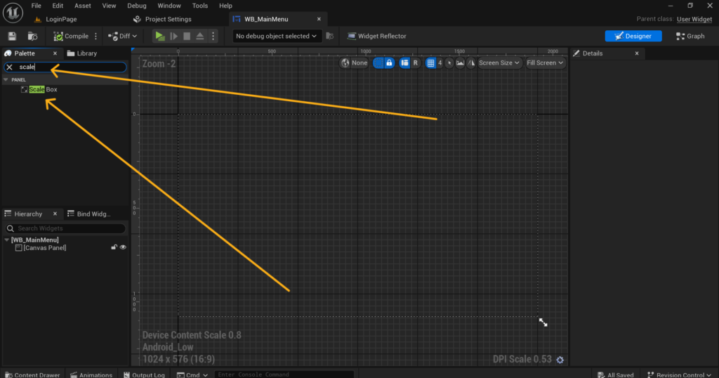
A Scale Box automatically scales its child widget to fit within the available space while maintaining the aspect ratio. This is perfect for things like your game logo, loading screen images or any UI element that should grow and shrink proportionally with the screen.
To use it open your Widget Blueprint, go to the Designer tab and in the widget palette search for Scale Box. Drag it onto your canvas and then place your image or element inside it as a child. The Scale Box will handle all the scaling automatically.
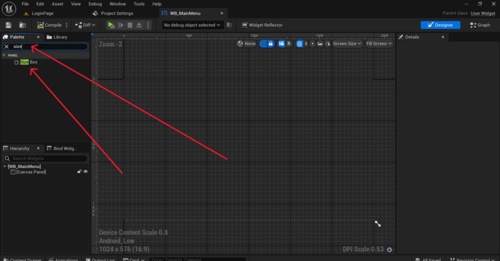
A Size Box lets you specify a fixed width and height in pixels for an element regardless of screen size. Use this for elements that must always be exactly the same size such as touch buttons that need a minimum tap area to be usable on all devices.
Step 5: Anchor Your UI Elements Correctly
Anchoring is one of the most important things to get right for mobile UI and one of the most commonly done wrong. When you place a widget on your canvas and set its position without anchoring it UE5 positions it relative to the top left corner of the screen. On a larger screen that position is the same number of pixels from the top left which means the element drifts away from where you intended it to be.
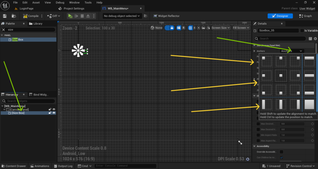
Anchors tell UE5 which part of the screen an element is attached to. A button that should always be in the bottom right corner should have its anchor set to the bottom right. This way no matter what the screen size is the button stays in the bottom right corner.
To set an anchor click on a widget in your Designer tab. In the Details panel you will see an Anchors dropdown at the top showing a grid of anchor positions. Select the position that matches where your element should live on screen. If your element should be in the bottom center select the bottom center anchor. If it should be in the top left select the top left anchor.
For elements that should stretch across the full width like a health bar at the top of the screen use a horizontal stretch anchor. This tells UE5 to stretch the element from the left edge to the right edge regardless of screen width.
After setting the anchor also make sure to set the Position values to define how far from that anchor point the element should sit. Using anchors combined with the DPI scaling curve will make your UI adapt correctly to virtually any Android screen size.
Part 2: Fixing Camera Notch Cut-offs
Step 6: Understanding the Safe Zone
The camera notch problem is a hardware issue. Many modern Android phones have a cutout at the top of the screen for the front camera. Some phones have a notch in the center, some have a punch hole on one side and some foldable phones have unusual screen shapes entirely.
Android provides a concept called the Safe Zone or Safe Area which is the part of the screen that is guaranteed to be fully visible without any hardware cutouts. If you keep all your important UI elements within this safe zone they will never be hidden behind a notch or punch hole camera.
UE5 has built-in support for the safe zone through a widget called the Safe Zone Widget.
Step 7: Wrap Your UI in a Safe Zone Widget
Open your main Widget Blueprint and go to the Designer tab. In the widget palette search for Safe Zone and drag it onto your canvas. Set it to fill the entire canvas by setting its anchors to stretch both horizontally and vertically.
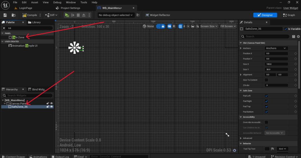
Now move all of your existing UI elements inside this Safe Zone widget as children. The Safe Zone widget automatically detects the device’s safe area at runtime and adds padding to push all of its children away from any hardware cutouts.
This means on a phone with a notch at the top your UI will automatically have extra padding at the top so nothing is hidden behind the notch. On a phone with no notch the Safe Zone adds zero padding and your UI uses the full screen.
This is the correct way to handle notches in UE5 and it works automatically across all Android devices without you needing to write any device specific code.
Step 8: Enable Safe Zone Debugging in the Editor
Testing the safe zone in the editor without a real device is possible using UE5’s built-in safe zone debugging tools. Go to Edit > Project Settings > Engine > User Interface and find the Safe Zone section. Here you can enable Debug Safe Zone and set custom padding values to simulate what your UI looks like on a device with a notch.
Set the top padding to something like 50 pixels and check your Widget Blueprint in the designer. You will see your Safe Zone widget push all its children down by that amount. This lets you verify that nothing important is hidden before you even install the game on a real device. You can also use the Console Command r.DebugSafeZone.TitleRatio 0.9 while running in the editor to simulate a safe zone that is 90 percent of the full screen size. Adjust the value to simulate different notch sizes.
Step 9: Handle Devices With Different Aspect Ratios
Beyond notches another common issue is that Android devices have wildly different aspect ratios. Standard phones are around 16 to 9 but many modern phones are 20 to 9 or even taller. Tablets are much wider relative to their height.
If your UI is designed for a 16 to 9 screen and a player runs it on a 20 to 9 phone you will have extra space on the sides or top and bottom depending on your game’s orientation. This extra space is called letterboxing and it shows up as black bars.
To handle this properly go to Edit > Project Settings > Engine > General Settings and find the Default Viewport Size section. Make sure your viewport is set to match your design resolution.
Then in your Widget Blueprints use the Scale Box widget set to Scale to Fit for any full screen backgrounds or images. This ensures they stretch to fill whatever aspect ratio the device has without leaving black bars.
For gameplay UI elements like your joystick and buttons use anchors as described in Step 5 to keep them locked to specific corners and edges of the screen. This way they always appear in the right place regardless of aspect ratio.
Step 10: Test on Multiple Real Devices
No amount of editor simulation replaces testing on real devices. Android fragmentation is real and what looks perfect on one phone can still look wrong on another.
If you only have one Android device for testing there are a few ways to simulate others. You can use Android Emulator in Android Studio which lets you create virtual devices with different screen sizes, resolutions and notch configurations. It is not perfect but it catches most layout problems before you reach real users.
When testing on a real device enable the developer option called Simulate display cutout which is available in Android 9 and above. This lets you simulate different notch types on your actual device even if it does not have one physically.
Check these specific things on every device you test. Make sure all buttons are fully visible and tappable. Make sure no text is hidden behind a notch or the system navigation bar. Make sure your background images cover the full screen with no black bars. Make sure buttons are large enough to tap comfortably without accidentally hitting another element nearby.
Checklist Before You Package
Before your next APK build go through this list. Make sure your DPI Scaling curve is configured in Project Settings. Make sure every Widget Blueprint has its design resolution set to your chosen reference resolution. Make sure all UI elements have proper anchors set. Make sure your main Widget Blueprint has a Safe Zone widget wrapping all important elements. Make sure you have tested with the safe zone debug padding enabled in the editor.
Final Thoughts
UI scaling and notch cut-offs are problems that every UE5 Android developer has to solve. The good news is that once you set everything up correctly it works across all devices automatically. You do not need to write device specific code or create separate UI layouts for different phones.
The three things that matter most are a properly configured DPI scaling curve, correct anchoring on every UI element and wrapping everything in a Safe Zone widget. Get those three things right and your UI will look correct on phones ranging from budget 720p devices all the way up to high end 4K flagships.
If your UI is still not looking right after going through these steps reach out at Admin@KaliPress.fun and share a screenshot of what you are seeing. UI problems are usually quick to diagnose once you can see exactly what is happening on device.

Solo Indie Game Developer and Unreal Engine (UE4 & UE5) Specialist with over 5 years of experience building optimized Android games from scratch.
I specialize in handling the full development pipeline independently taking mobile titles from concept to high-performance, publishing ready APK/AAB builds. Highly focused on rendering optimization for low-to-mid range devices, Blueprint scripting, and custom mechanics.
Through this blog, I share my practical knowledge and tutorials to help aspiring developers master the Unreal Engine mobile ecosystem.